Process Map Template: See the Whole Workflow at a Glance for 2026
A process map template is the next level past a flow chart. A flow chart shows the sequence; a process map adds the operational facts around each step: which lane owns it, what it consumes and produces, how long it takes, and who receives the result. That extra layer is what turns a picture into a management tool. The moment a process crosses teams, the interesting questions stop being "what happens next" and become "whose queue is this sitting in, and for how long," and only a map with lanes and timing can answer them.
The formats differ by question. Swimlane maps assign every step an owner lane and make handoffs visible. SIPOC maps zoom out to the supplier-input-process-output-customer chain, which is the right view for scoping a fix or onboarding a partner. Value stream maps add the clock: touch time versus wait time per step, so you can see where the days go. A step log is the daily driver, one row per step with its system and owner. All four live below as working spreadsheets, because a map that cannot be edited is a map that will not be updated.
Four process map templates, free to download
Each version below is a working spreadsheet, not a blank grid with a title row. The fields are pre-filled with realistic example content from fictional companies, a mortgage brokerage and a plant nursery warehouse, so you can see how a finished process map reads as a table, then overwrite it with your own process. No email address required.
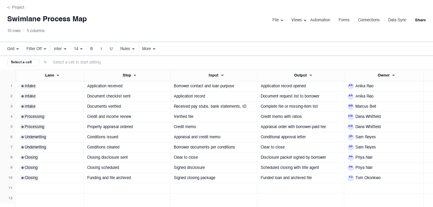
Swimlane Process Map
The swimlane process map assigns every step to a lane with its input, output, and owner, so the map reads as a relay rather than a pile of tasks. Use it when work crosses teams and the question is where it stalls, like the mortgage application flow pre-filled here across intake, processing, underwriting, and closing. The lane column earns its keep the first time you filter by it: whatever lane owns the most steps is your busiest team, and the steps at its boundaries are where applications wait.
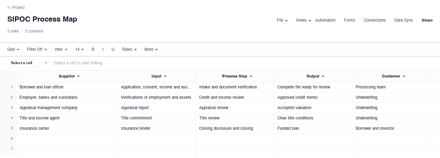
SIPOC Process Map
The SIPOC process map zooms out one level: five rows covering the suppliers, inputs, process, outputs, and customers of the whole workflow, with the detail of each written into a single cell. Use it to scope a project, brief a vendor, or agree on boundaries before mapping the details. The boundary discipline is the feature that earns its keep: forcing the team to name the first and last process step on one row stops the map from quietly absorbing every neighboring process.
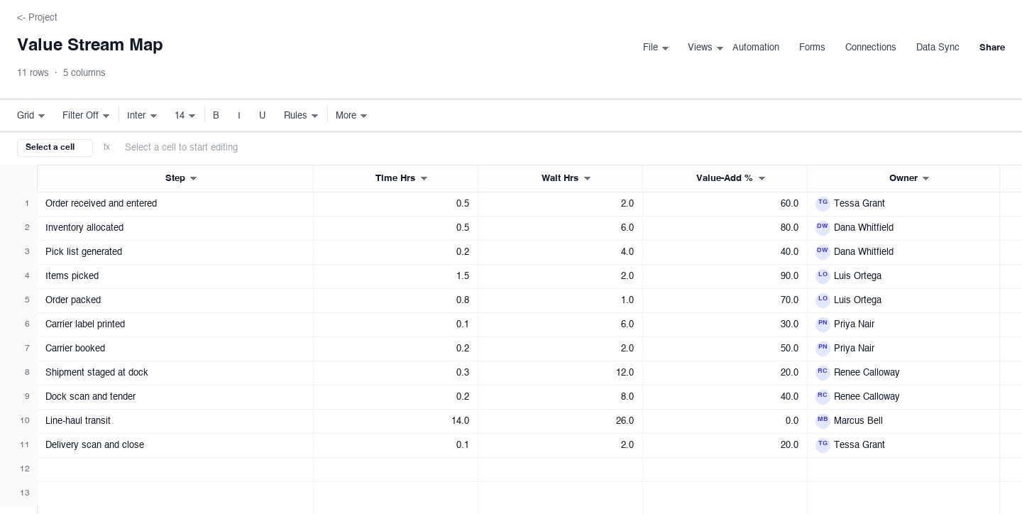
Value Stream Map
The value stream map adds the clock: for each step, the touch time, the wait before it starts, a percent value-add call, and the owner. Use it when the process is correct but slow, like the warehouse pick path pre-filled here, where a four-day door-to-door time turns out to be only about thirteen percent real work. The wait column is the one that pays for the exercise: it usually holds the largest numbers on the sheet, and every wait you remove is calendar time returned to the customer.
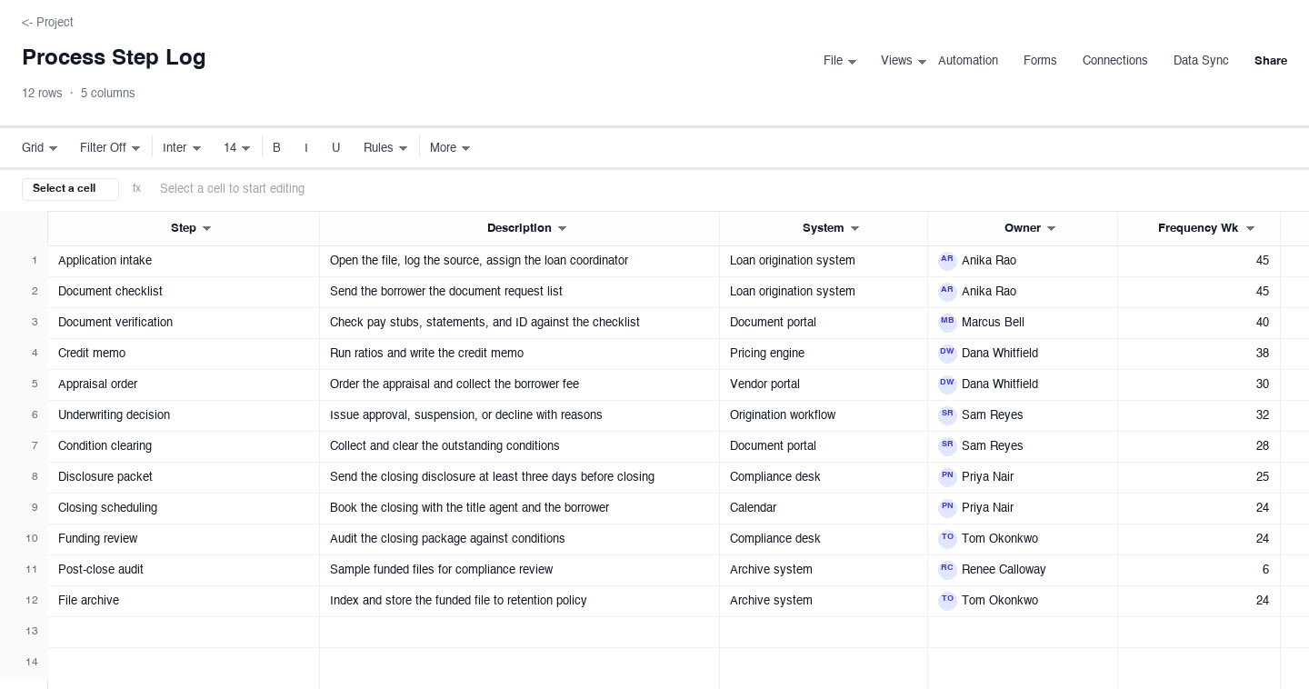
Process Step Log
The process step log is the daily driver: one row per step with its description, the system it runs on, the owner, and how often it fires. Use it as the living reference a team actually opens, or as the backbone for an internal walkthrough, like the mortgage log pre-filled here. The frequency column earns its keep during staff changes: a new hire who can see that document verification runs forty times a week knows where to point their first questions, and the log answers most of them.
How to map a process people will actually use
Pick one format per question, not per preference
SIPOC answers "what is the boundary of this process." Swimlane answers "who does what, and where does it hand off." Value stream answers "where does the time go." Step log answers "what do we run every day, and on what system." Teams that pick one format and force it to answer every question produce maps nobody reads. Start with the question you actually have this quarter, map in that format, and let the other views grow out of the same rows later rather than maintaining four diagrams.
Fix the first and last step before anything else
Boundary creep is the failure mode that kills process maps. "Onboard a new client" quietly becomes "run the business." Write the trigger and the terminal state as rows first: "application received" to "funds disbursed" for the mortgage example above. Everything between those two rows is in scope; everything outside is somebody else's map. A tight boundary is also what makes the map testable, because you can count cycle time from trigger to outcome without arguing about which edges count.
Map the real process, not the policy process
The fastest way to lose a room is to map what the procedure document says happens. Walk the floor instead: sit with the person who does step three and ask what they actually do, including the spreadsheet on the side and the phone call that is not in any system. Workarounds are not deviations to correct; they are the process's immune system responding to something the map has not captured yet. Every undocumented workaround you record is a defect in the official flow, flagged for free.
Name an owner and an output for every step
A step with no owner is a rumor, and a step with no output is make-work. The swimlane and step log variants above carry both as columns, and the discipline matters more than the document: when every step produces something named, the gaps surface on their own. If two steps produce the same output, one of them is redundant. If a step produces nothing the next step consumes, ask why it exists. Ownership questions get the same treatment: if two owners appear on one step, the map is hiding a committee.
Time the waits, not just the work
In almost every operational process, wait time dwarfs touch time. The value stream variant above shows the pattern: a warehouse pick path where the work takes about eighteen hours and the elapsed time takes four days. The other seventy percent is queues, and queues are where capacity and staffing problems live. Measure each step twice: how long the step itself takes, and how long work sits before the step starts. Improvement projects that only attack touch time are polishing the smallest number on the sheet.
Update the map on every change, or retire it
A process map decays faster than any other document in the company, because processes change weekly and maps change yearly. The fix is to make updating cheaper than ignoring: keep the map in a spreadsheet where a changed step is one edited row, assign the update to the process owner rather than a central team, and review the map in the same meeting where process changes get approved. If the owner will not commit to that, do not build the map at all; a wrong map costs more than no map, because it trains people to distrust every document.
Frequently asked questions
What is the difference between a process map and a flow chart?
A flow chart shows the sequence of steps and decisions. A process map wraps operational facts around the same sequence: owners, lanes, inputs and outputs, timing, and the customer view. Every process map contains a flow chart, which is why the two pages pair well, but a flow chart alone cannot answer "whose queue is this in." Use the flow chart template when you need to communicate the path, and this page when you need to manage it.
What is a SIPOC map used for?
SIPOC stands for supplier, input, process, output, customer. It is the zoomed-out view: five rows that describe the whole workflow at boundary level, with the detail of each element in one cell. Use it to scope a project before detailed mapping, to brief a vendor or partner on what your process needs from them, or to settle a boundary argument. The discipline it enforces, naming the first and last step explicitly, is worth the five minutes it takes even when you never build the detailed map.
What is the difference between a swimlane map and a value stream map?
They answer different questions and often complement each other. A swimlane map assigns each step to an owner lane with its inputs and outputs, so it exposes handoffs and overloaded teams. A value stream map keeps the sequence and adds the clock: touch time, wait time, and a value-add call per step, so it exposes queues. Run the swimlane first to fix ownership, then the value stream to fix speed. The examples above show the pair: the mortgage flow across lanes, the nursery pick path across hours.
How detailed should a process map be?
One row per state change, at the grain someone new needs to run the work. The maps above run seven to ten steps for processes that cross several teams, which is the right zone for an operational document. Detailed work instructions belong in a standard operating procedure, not in the map; the map should link to the SOP, not swallow it. If your map passes fifteen rows, either you are mapping more than one process, or you are mapping at a grain finer than anyone needs to navigate.
Who should build the process map?
The people who do the work, facilitated by whoever owns the outcome. A map built by a central team from interviews looks fine and validates nothing; the people doing the work will nod at it and keep doing what they actually do. Get the step owners in one room, walk one real case through the sequence, and let them correct the map in real time. The corrections are the value. Whoever facilitates should be capturing workarounds and side spreadsheets as eagerly as official steps.
What is the fastest way to find the bottleneck in a mapped process?
Count the handoffs and total the waits. Handoffs are where work queues, so the lane that receives the most arrows in the swimlane view is your first suspect. Then look at the wait column in the value stream view: the largest wait usually sits just before the busiest lane. Fix those two spots before optimizing anything else, because every minute removed from a bottleneck comes straight off total cycle time, while minutes saved anywhere else just move the queue.
How do I keep a process map from going stale?
Assign it an owner and tie updates to real events, not to good intentions. The map needs a refresh when the process changes and when the pain returns: a new system, a new hire role, a new regulation, or a complaint that a step nobody remembers keeps causing. A quarterly fifteen-minute review of the step log catches drift while it is still cheap to fix. The practical rule is that the map lives where the work lives: linked from the team workspace, editable by the people who run the process, and printed only when an auditor asks. A map locked in a quality folder will quietly diverge from reality within two process changes, which is worse than no map at all.
Run it live instead of in a file.
The downloads above are yours either way. In Wisegrid the same template becomes a working sheet with owner contacts, status dropdowns, reminders, and dashboards. 7-day free trial, no credit card required.