Flow Chart Template: Map Any Process From First Step to Last for 2026
A flow chart template is the fastest way to make a process visible. Instead of describing how work moves in a paragraph nobody can follow, you list each step as a row: what happens, what shape of step it is, what triggers the next one, and who owns it. Decisions get their own rows with a labeled branch for each answer, so the chart shows not just the happy path but every path the work can actually take, including the ones that end in a refund, a rejection, or a handoff to another team.
Drawn flow charts are fine for a slide, but the spreadsheet version is the one that stays current. Each step is a record you can sort, filter, assign, and date, and when the process changes you edit the row, not the diagram. That matters because an out-of-date process map is worse than none: it trains new hires to do the wrong thing with confidence. A grid with an owner column stays honest, because ownership is written next to every step.
Four flow chart templates, free to download
Each version below is a working spreadsheet, not a blank grid with a title row. The fields are pre-filled with realistic example content from a fictional home goods brand, so you can see how a finished flow chart reads as a table, then overwrite it with your own process. What you download is an everyday spreadsheet file, compatible with all the usual tools. No email address required.
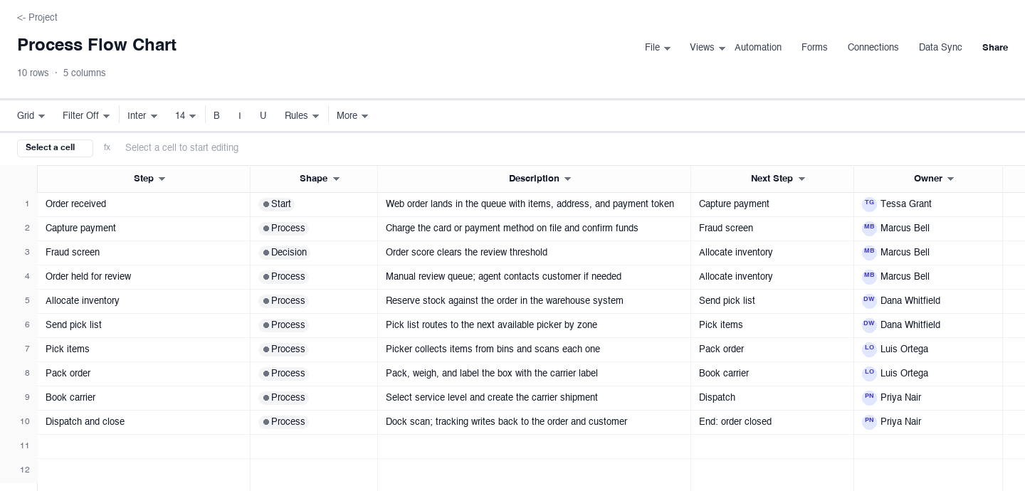
Process Flow Chart
The process flow chart is the everyday sequence map: one row per step, a shape column marking starts, processes, and decisions, a short description, the step that follows, and the owner. Use it for any linear or lightly branching workflow, like the order-to-ship path from a fictional home goods brand shown here. The next-step column is the feature that earns its keep: read it top to bottom and you have the whole chart in words, which is the fastest sanity check that no step dangles with nowhere to go.
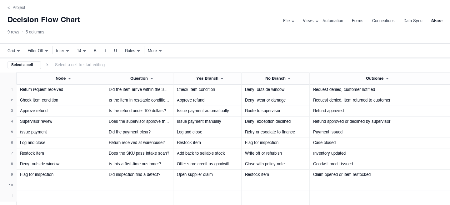
Decision Flow Chart
The decision flow chart is built for processes that fork: each row is a node carrying the question it asks, a labeled branch for the yes answer and the no answer, and the outcome each path lands on. Use it for anything with approvals, eligibility checks, or exceptions, like the refund path pre-filled here, where every denial ends in a named outcome instead of a dead end. Writing both branches before you need them is what keeps an edge case from becoming a hallway conversation with a customer waiting.
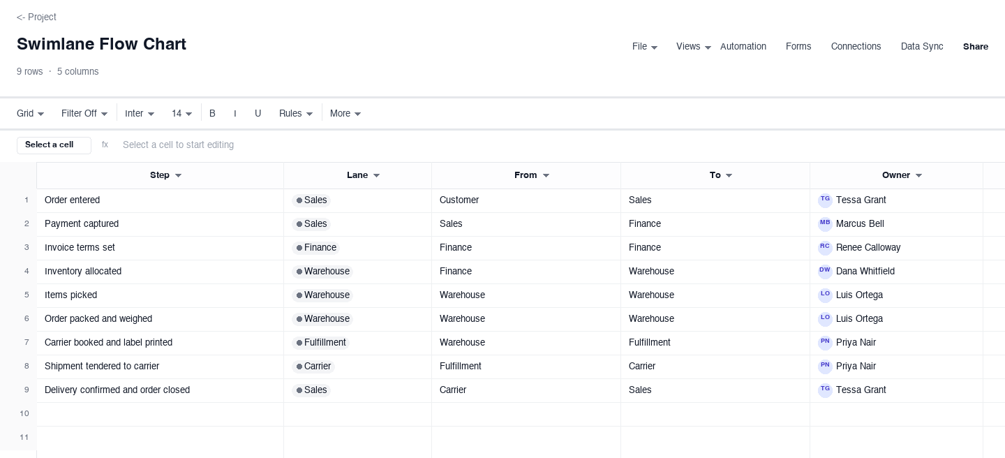
Swimlane Flow Chart
The swimlane flow chart splits a process across the teams that touch it: every step names its lane, its from and to, and its owner, so the chart shows the handoffs rather than hiding them. Use it when work crosses departments, like the order-to-ship flow here moving between sales, warehouse, and carrier lanes. The from and to columns earn their keep the first time you look for a bottleneck: whichever lane receives the most arrows is usually where work queues up and ages.
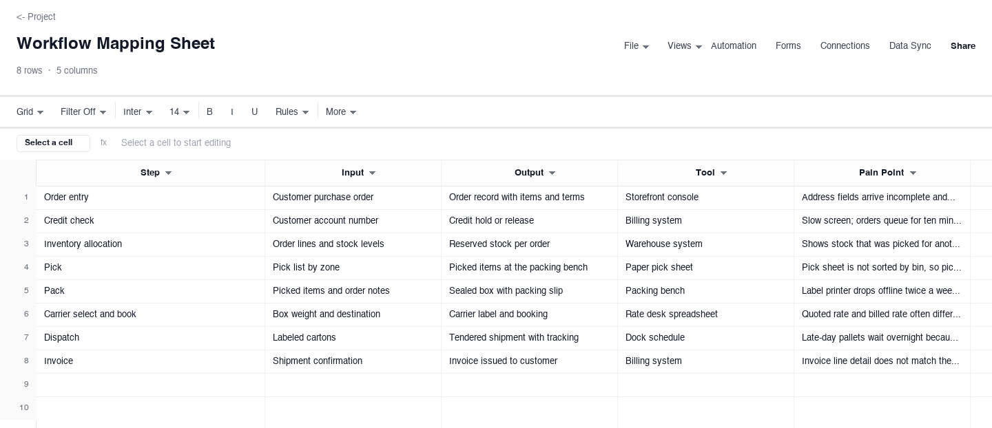
Workflow Mapping Sheet
The workflow mapping sheet is the diagnostic version: for each step it records the input, the output, the tool used, and the pain point people hit there, on top of the sequence itself. Use it when a process works but grinds, like this order-to-cash walkthrough with its retyped addresses and printer stalls. The pain point column is the one that pays off: collect a month of entries and you have a prioritized list of fixes ranked by how often each step actually hurts.
How to build a flow chart people actually follow
Name the start and the end before the middle
Every process has a trigger and a terminal state, and writing those two first keeps the chart honest. "Order received" and "shipment delivered" bound this page's example; a refund process might start at "request received" and end at either "payment issued" or "request denied." Charts that balloon usually failed here: the team mapped everything that could happen instead of everything that happens between two specific points. Keep the boundary tight and the rest of the map stays tight with it.
Give every step one row and one verb
A step is the smallest unit of work that changes the state of the thing being processed: capture payment, verify address, book carrier. If you catch yourself writing "and" in a step description, that is two steps sharing a row, and each deserves its own. Small steps are not bureaucracy; they are where decisions and wait time hide. The examples above average six to nine steps for paths that cross several teams, which is the right grain for a document people will actually read.
Reserve the decision shape for real branches
Not every step is a decision. A decision row is one where the answer changes the path: eligible or not, approved or not, in stock or backorder. Label each branch explicitly, yes or no in the decision variant, or the named next step in the process variant. An unlabeled arrow out of a diamond is the single most common flow chart failure, because the next person to read the chart has to guess which answer goes where, and teams that guess usually guess wrong.
Put an owner on every step, not just the chart
A flow chart without owners is a rumor about how work happens. The owner column makes each step somebody's job, and for swimlane charts the from and to columns do more: every arrow that crosses a lane is a handoff, and handoffs are where work waits. When a process feels slow, count the handoffs. The lane that receives the most arrows is your queue, and the fix is usually fewer crossings, not faster people inside the lanes.
Write the outcome into every terminal step
Every path through the chart should end in a named outcome, not an arrow that stops. "Payment issued," "request denied," "order canceled and restocked": the outcome column is what turns the chart into a contract about what the process produces. It also gives you something to count. If a quarter of refund requests end in "denied," that ratio is a signal about your product page, your sizing, or your policy, and you only see it because the outcomes were written down.
Treat the chart as a living table, then test it
The reason to keep a flow chart in a spreadsheet is that it behaves like data: sort by owner to see one person's load, filter to decisions to audit your branches, date rows when the process changes so you know which version people used. Then test the map the way you would test anything load-bearing. Hand it to someone who does the work weekly and ask them to walk one real case through it. The first time they say "well, actually" is the row you got wrong, and it is almost always a decision you did not know existed.
Looking for a flowchart template?
You are in the right place. "Flowchart" is just the closed-up spelling of flow chart, and the templates above are flowcharts: the same start and end shapes, the same process and decision logic, the same branching. The difference is the medium. A drawn flowchart is a picture you paste into a slide; the spreadsheet version is a table you can sort, filter, assign, and keep current as the process changes, which is the part that usually fails first.
If you specifically need a picture, the process flow chart variant converts in one step: each row is a box, and the next-step column is the connector. Import the rows into any diagramming tool, or sketch the ten boxes by hand. The work that makes a flowchart good, naming the steps, the decisions, and the owners, is identical either way, and the spreadsheet version forces you to do it.
Need a workflow template instead?
A workflow template is the same idea aimed at operations instead of communication: not just what order the steps run in, but what each step consumes and produces, what tool it runs on, and where it hurts. The workflow mapping sheet variant above is exactly that: step, input, output, tool, and pain point in one grid, pre-filled with a small order-to-cash workflow.
Use the flow chart variants when you need to show the path to someone new, and use the workflow mapping sheet when you need to improve the path yourself. The pain point column turns a month of routine work into a ranked fix list, which is the deliverable a drawn workflow diagram cannot give you. Many teams keep both: the map for the meeting, the sheet for the work.
Frequently asked questions
What are the shapes in a flow chart?
Four shapes carry almost everything. A rounded rectangle marks the start or end of the process. A plain rectangle is a process step, one unit of work. A diamond is a decision with at least two labeled branches, usually yes and no. An arrow is the flow from one shape to the next. The process flow chart variant above encodes the first three in its shape column, so the table reads exactly like the diagram, and the next-step column replaces the arrows.
What is the difference between a flow chart and a process map?
A flow chart shows sequence and decisions: what happens, in what order, and where the path branches. A process map goes further and adds ownership, inputs and outputs, timing, or a customer view, depending on the format. Every process map contains a flow chart, but most flow charts are not yet process maps. If you just need to explain the path, start here; if you need to hand the work between teams or time the steps, move up to the process map template, which carries the same path with lanes and owners attached.
How do I show a decision with more than two branches?
Split it into two diamonds. A decision with three outcomes is really two questions wearing one costume, and forcing it into a single row with three branches produces a chart nobody can navigate. Ask the highest-stakes question first: is the return within the window? Then ask the next one of the survivors only: is the item in resalable condition? Two clean binary decisions behave better than one messy three-way branch, and each one keeps its own explicit yes and no label.
Is this the same as a workflow template?
Close cousins. A workflow template usually means the operational view of a process: the steps plus what each one consumes and produces, what tool runs it, and where the friction lives. The workflow mapping sheet variant above is a workflow template in that sense, with the pain point column doing the diagnostic work. Use the flow chart variants to communicate a path and the workflow mapping sheet to improve it. The steps are the same in both; only the questions you ask of them change.
How detailed should a flow chart be?
Detailed enough that a new hire can run the process without asking what happens next, and no more. For most operational paths that means one row per state change, with decision diamonds only where the path actually forks. The examples above run six to nine steps for paths crossing several teams. If your chart passes fifteen rows, check whether you are mapping more than one process, or mapping a process at a finer grain than anyone needs to run it.
Why keep a flow chart in a spreadsheet instead of a drawing tool?
Because the chart is only useful while it is current, and tables stay current better than diagrams. A spreadsheet version sorts by owner, filters to just the decision rows, carries contact columns for the people who own each step, and changes by editing a cell instead of rearranging shapes. When the process changes on a Tuesday, you update one row and the whole map is accurate again. A drawing tool is better for the slide; the spreadsheet is better for the work.
Run it live instead of in a file.
The downloads above are yours either way. In Wisegrid the same template becomes a working sheet with owner contacts, status dropdowns, reminders, and dashboards. 7-day free trial, no credit card required.