Organizational Chart Template: Free Downloads and a Build Guide for 2026
An organizational chart is the map of how a company actually fits together: who reports to whom, which roles sit in which department, and where the lines of accountability run when a decision has to be made. A good organizational chart template turns that map into a living sheet rather than a diagram someone exported for a board deck and never opened again. Used well, it is the fastest answer to the questions every week brings: who owns this, who covers when they are out, and where does this request go next.
The charts that fail are the ones built as pictures instead of data. When the reporting structure lives in a spreadsheet, one row per person or role, it can be sorted by level, filtered by department, and reconciled against the payroll roster in minutes. That is the discipline behind every version on this page: a company-wide chart, a single-department chart with deputies, a roles-first chart for headcount planning, and a matrix chart for dual reporting. Each is pre-filled with a fictional regional hospital or a growing startup so you can see the finished shape before you overwrite a cell.
Four organizational chart templates, free to download
Each version below is a working spreadsheet, not a blank grid with a title row. The fields are pre-filled with realistic example content from a fictional regional hospital and a growing startup so you can see how a finished organizational chart reads, then overwrite it with your own details. What you download is an everyday spreadsheet file, compatible with all the usual tools. No email address required.
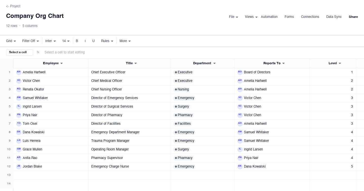
Company Org Chart
The company org chart is the whole organization on one sheet: every employee, their title, department, direct manager, and level, sorted so the reporting structure reads top to bottom. Use it as the reference when a new hire asks who owns what, when you are planning headcount, or when a reorg needs writing down before it is announced. The level column keeps titles honest: two people with the same level should carry similar scope, even if their titles sound different.
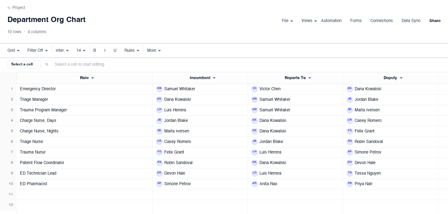
Department Org Chart
The department org chart zooms into a single department and shows four facts per row: the role, who holds it now, who they report to, and who covers for them. Use it in departments with shift leads and deputies, like emergency services or fulfillment, where the acting chain matters as much as the formal one. The deputy column is the one HR files rarely carry, and it is the first thing you reach for when a manager is out on a holiday weekend.
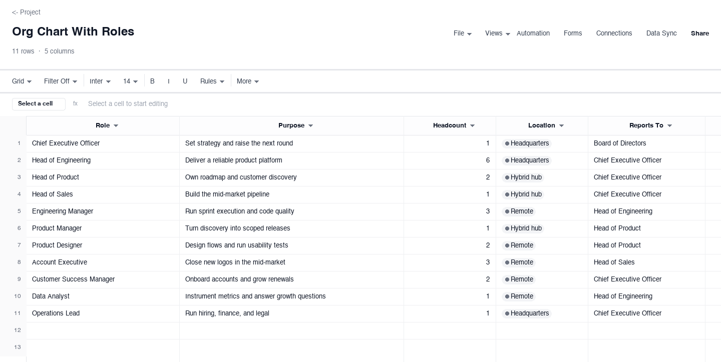
Org Chart With Roles
The roles-first org chart drops names entirely and maps each role to its purpose, headcount, location, and manager. Use it when the structure is changing faster than the roster, or when you want to debate scope without the friction of names attached. It doubles as the headcount budget: summing the headcount column gives planned size, and comparing that to actual hiring shows where the plan and reality diverged.
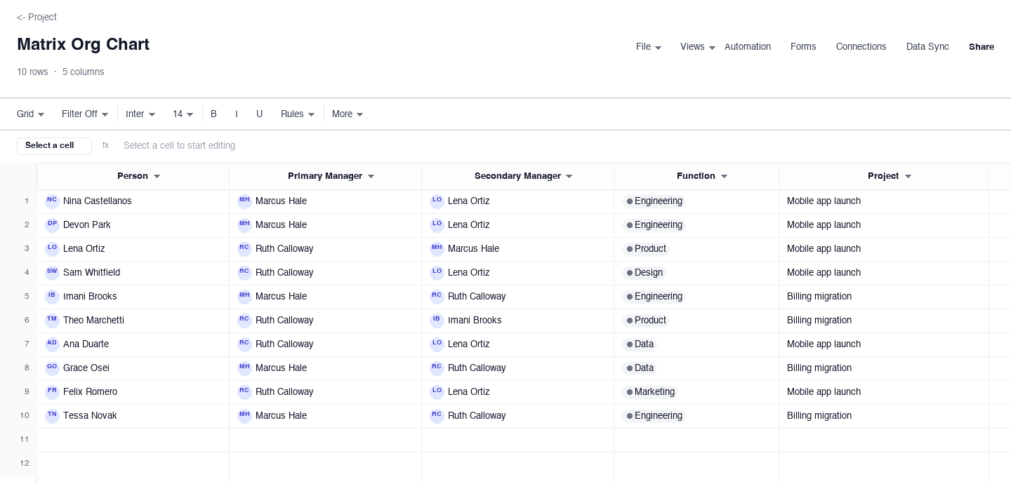
Matrix Org Chart
The matrix org chart is for organizations where people have two managers: a primary manager who runs their function and a secondary manager who runs the project they are assigned to. Each row pairs a person with both managers, their function, and their current project. Use it when cross-functional work keeps colliding with the reporting structure, and the chart settles the recurring question of whose priority wins when the two pull in different directions.
How to build an organizational chart that stays current
Decide what the chart is for
An org chart built to onboard new hires looks different from one built to plan a reorg, and mixing the two purposes is how charts bloat. Before the first row, write one sentence about the decision the chart supports: who do I talk to, where is the headcount going, or who covers when someone is out. That sentence decides whether you chart people or roles, how many levels you show, and which columns earn their place. A chart that tries to serve every audience serves none, and it gets ignored by all of them within a quarter.
Collect the four facts for every position
Every row of a working chart needs four facts: name or role, title, department, and manager. Pull them from the payroll or HR system rather than from memory, because memory is where departed employees and outdated titles live. Send each manager their own rows to confirm, and treat a blank manager cell as a bug to fix, not a formatting choice. Twenty minutes of verification here saves the awkward meeting where someone points at a wrong reporting line in front of their own team.
Pick one convention for reporting lines and stick to it
Decide whether manager means the person who does the review, the person who assigns the daily work, or the budget owner, because in matrixed teams those can be three different people. Write the definition in the sheet header and apply it to every row. The most common chart failure is not wrong data but mixed conventions, where some rows list the administrative manager and others list the project lead, and the whole chart quietly stops meaning one thing. Consistency beats elegance every time.
Build from the top down, one level at a time
Start with the chief executive, then fill each level completely before moving down, and resist sketching boxes until the rows are right. Sorting by level surfaces structural problems immediately: a span that jumps from three reports to twelve, a manager with triple the direct reports of peers, or a department whose people report into three different parents. Fix those in the sheet, where editing is cheap, before they harden into a diagram someone screenshots and circulates as the truth.
Mark vacancies and acting coverage honestly
An org chart that shows a role filled when it has been empty for two months teaches everyone to route around it. List the incumbent, and when the seat is open, put the acting coverage in plain text so the chain of command survives the gap. The same honesty applies to deputy or backup columns: name a real person with a real role, not a team name, because in an incident nobody has time to interpret what a team name means. Charts earn trust by showing the organization as it is.
Publish one version and control who can edit
Decide early where the official chart lives and make sure everyone knows the address, because the first time someone finds two different versions, the chart is finished as a source of truth. Keep one master sheet, share it read-only to the wider team, and limit edit rights to the owner plus HR. If you export a diagram for a deck, label it with the date and the source, so a stale picture cannot masquerade as the current structure six months later when someone digs it out of a shared drive.
Set a review cadence before the chart goes stale
Every chart rots; the only choice is whether it rots on a schedule you control. Give the chart one named owner, put a recurring thirty-minute review on the calendar, and open the HR roster beside it to catch hires, exits, and manager changes from the last cycle. Growth-stage companies need monthly reviews; stable ones can live with quarterly. Whatever the cadence, update the chart the week a change happens, because a chart three reorganizations behind is worse than none: it is misinformation with your logo on it.
Frequently asked questions
What is an organizational chart?
An organizational chart is a map of who reports to whom in a company or department: roles or names arranged in levels, with columns or lines that make the reporting structure legible at a glance. Beyond orientation, a good chart is a management tool. It exposes spans of control that have grown too wide, departments carrying three layers where one would do, and single points of failure where one resignation would leave a whole function without leadership. Charts also settle ownership questions in seconds, which is why new hires should get one on day one.
How do I build an organizational chart from scratch?
Start with the four facts every row needs: the role or person, their title, their department or function, and who they report to. Collect them in a sheet first, one row per person, because a spreadsheet forces gaps to surface: anyone whose manager cell is empty is either the chief executive or a data problem. Then sort by level so the hierarchy reads top to bottom, and only then draw boxes, if you draw them at all. The sheet is the source of truth; the diagram is just a view of it.
How often should an org chart be updated?
Assign one owner and review the chart on a fixed cadence, monthly for fast-growing companies and quarterly for stable ones, with an immediate update whenever someone joins, leaves, or changes manager. The failure mode is always the same: the chart gets built for a board deck, then quietly lies for nine months while three reorganizations happen around it. A short scheduled review, ten minutes with the HR roster open, costs almost nothing and keeps the chart trustworthy enough that people actually use it.
Should an org chart show names or just roles?
Show names when the audience is internal and the chart answers who do I talk to; show roles only when the chart is for headcount planning, recruiting, or an external audience. Many teams keep both: a names version for the team and a roles version for budgeting, where each role carries its purpose, planned headcount, and location. The roles version travels better because it stays accurate through departures and does not leak personal information.
How do I show dotted-line reporting on an org chart?
A dotted line, or in a spreadsheet a second manager column, means a working relationship that cuts across the formal hierarchy: a person reports day to day to a project lead but administratively to a department head. The rule that keeps matrix charts readable is to mark exactly one primary manager per person and treat every other line as secondary. If someone appears to have two primary managers, you have described a committee, not a reporting structure, and nobody can be held accountable.
What is the difference between an org chart and a headcount roster?
A roster is a flat list of people with their details; an org chart adds the relationships between them, specifically who reports to whom. Rosters answer how many people we have; org charts answer who works for whom and how the work is divided. In practice you keep one sheet that serves both: the reporting columns make it a chart, and grouped counts by department make it a roster, so you never maintain two sources that drift apart between updates.
Run it live instead of in a file.
The downloads above are yours either way. In Wisegrid the same template becomes a working sheet with owner contacts, status dropdowns, reminders, and dashboards. 7-day free trial, no credit card required.