MS Project Dashboard: The Best Way to Build One in 2026
An MS Project dashboard is the shareable, at-a-glance layer that a Microsoft Project plan does not give you on its own: overall schedule health, milestone dates against baseline, percent complete by phase, resource load, and what is due next, readable by people who will never open an .mpp file. Microsoft Project is a scheduling engine, and a capable one. The dashboard problem exists because a plan’s audience is usually ten times larger than the group who can edit it.
The practical route is not to fight the tool. Export the schedule data to Excel, which Microsoft Project supports natively, and build the dashboard on that flat table. This page walks the whole path: which fields to export, how to shape them, the six widgets worth building, and how to keep the weekly refresh down to minutes. The templates below give you the data table pre-structured, and if you import one into Wisegrid, the dashboard widgets read the live sheet directly.
Dashboard data templates, free to download
Each download below is a pre-structured schedule table with realistic example tasks, milestones, and baseline dates, shaped the way a dashboard wants to read them. Every file is a plain .xlsx that opens in Excel, Google Sheets, or any spreadsheet app, and imports straight into Wisegrid, formulas included. No email address required.
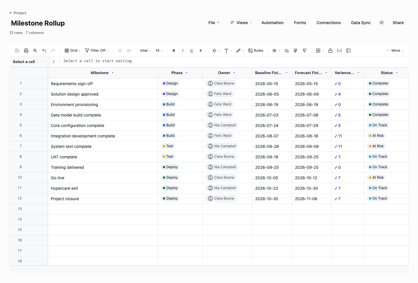
Milestone Rollup
The milestone rollup is the headline table of the dashboard: every milestone with its phase, owner, baseline finish, current forecast, and a live variance-in-days formula that flags slippage the moment a forecast moves. Use it as the first thing an executive sees, because baseline variance is the single most information-dense number a schedule produces. It is built to receive exactly the fields a Microsoft Project export provides, so refreshing it is paste-and-done.
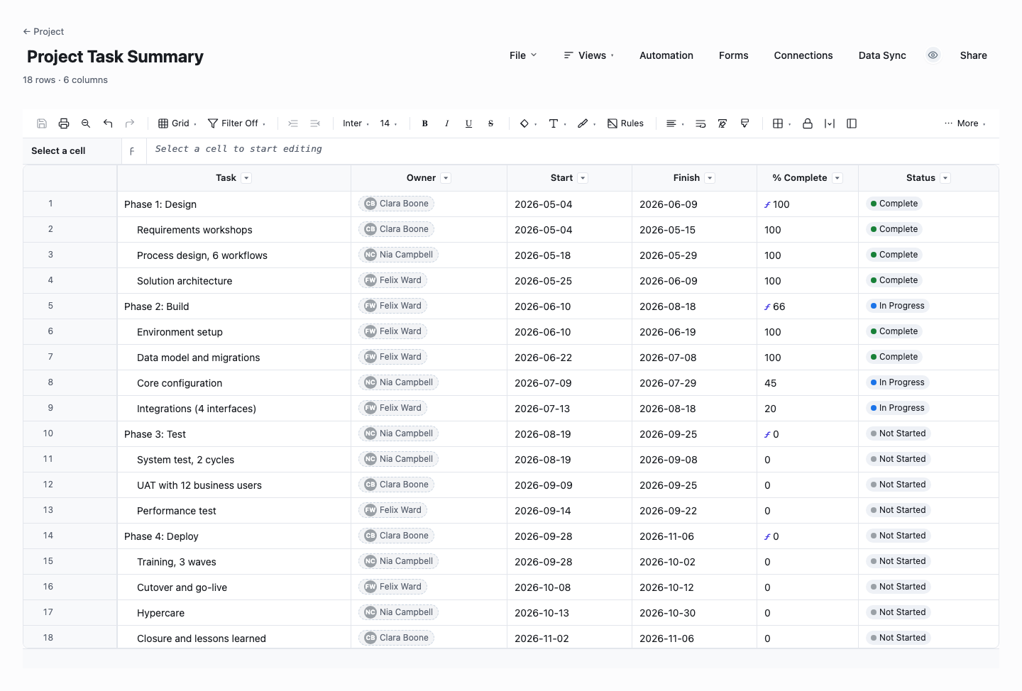
Project Task Summary
The task summary holds the working schedule: phases as parent rows, tasks as children, and a live rollup formula that averages each phase’s percent complete from its child tasks, so the phase-level picture maintains itself. Use it as the layer between the milestone rollup and the raw plan, for the reader who asks why a milestone moved and wants the answer two clicks deep, not two meetings later.
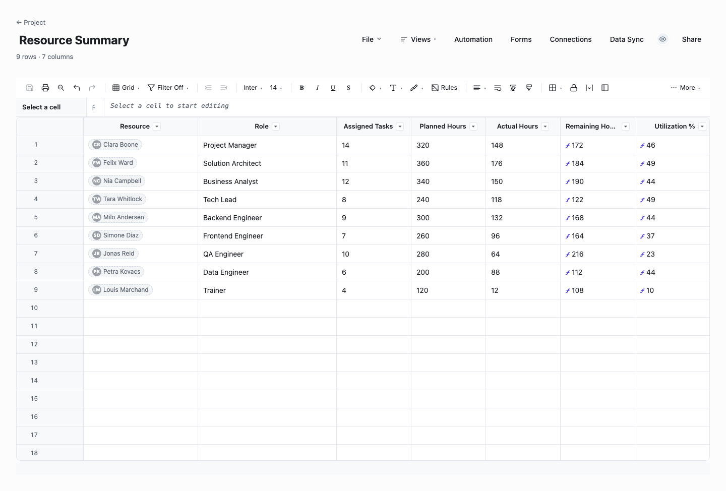
Resource Summary
The resource summary shows who is carrying the project, in numbers: planned against actual hours per person, with live remaining-hours and utilization formulas. Use it when the schedule questions turn into people questions, which they always do, because a slipping milestone almost always resolves to a person carrying more than their hours. It is the resourcing half of any project dashboard and the table your next staffing conversation should start from.
How to build a dashboard from a Microsoft Project plan
Decide who the dashboard is for before you build it
A scheduler wants float and the critical path, a sponsor wants dates, money, and risk. The team wants what is due this week. Pick the primary audience and let that choose the widgets, because a dashboard for everyone ends up read by no one. Most teams need the stakeholder version first, since the plan itself already serves the scheduler perfectly well.
Export the plan to Excel, not to a screenshot
Use Save As or the Export Wizard to produce an Excel file from the plan. Both are built into Microsoft Project. Choose the fields the dashboard needs: task name, outline level, start, finish, percent complete, resource names, the milestone flag, and the baseline dates. Screenshots of Gantt views go stale the moment the plan changes. A data export can be repeated in a minute and feeds every widget from the same numbers.
Flatten the data into one clean table
Dashboards read tables, not outlines. Keep one row per task and one column per attribute, and add a Phase column derived from your summary tasks so progress can group by phase. Delete blank rows, keep a single simple header row, and resist merged cells. This is also exactly the shape a one-click Excel import expects, so the same cleanup pays twice.
Build the six widgets that answer the standing questions
Schedule health as a status derived from baseline variance, a milestone timeline showing baseline versus forecast, percent complete by phase, resource load as task count or hours per person, an upcoming-and-overdue list, and total slippage against baseline. Those six cover what any review meeting asks. Add a seventh only when someone asks the same extra question twice.
Compute variance from the baseline, not from memory
The baseline columns are the reason to include them in the export: finish minus baseline finish per task, summed and sorted, shows exactly where the schedule moved and by how much. Without a baseline, the dashboard can only say where things are, not whether that is better or worse than what was promised, and the second question is the one executives actually ask.
Make the refresh a habit, not a project
Fix a rhythm that matches your plan updates: re-export after every scheduling session or every Friday, whichever comes first. Keep the export settings identical each time, same fields in the same order, so the refresh is paste-and-done. In a live sheet the widgets recompute on save, making the refresh a genuine two-minute job, and a dashboard that costs two minutes a week is a dashboard that stays alive.
Share it read-only, where people already look
The dashboard’s value is that stakeholders stop asking for the plan. Publish it as a read-only link rather than an attachment, so everyone sees the current version instead of last month’s email. In Wisegrid a dashboard carries a public read-only share link out of the box, while the underlying sheet stays editable only by the people who own the plan.
Getting your plan out of Microsoft Project cleanly
Microsoft Project offers two workable paths to Excel. Save As with the Excel Workbook type runs the Export Wizard, where you pick a map of task fields. Visual Reports also exports to Excel, but it is built around pivot tables, which is more machinery than a dashboard table needs. For this job the Export Wizard is the right tool: choose the task table, select your fields once, and save the map so the next export is identical to this one.
Field selection is most of the quality. The minimum set is task name, start, finish, percent complete, resource names, and the milestone flag. Add baseline start and baseline finish if the plan has ever been baselined. If it has not, set a baseline before the next replan, because variance reporting is impossible without one. Outline level or the summary-task name lets you reconstruct phases in the flat table.
Keep the export repeatable: the same saved map, the same field order, the same file naming pattern. The point of the dashboard is that refreshing it is boring. If every export needs re-fiddling, the refresh gets skipped, the dashboard goes stale, and stakeholders go back to asking for the .mpp file that most of them cannot open.
Keeping the dashboard live after the import
A spreadsheet dashboard works, but it inherits the spreadsheet problem: the file is wherever it was last emailed. Importing the same table into a shared grid changes the physics. The one-click Excel import brings the tasks, dates, and percent complete in as live columns, and dashboard widgets read that sheet directly, so a refresh is pasting the new export into the same sheet rather than rebuilding charts.
The columns stay useful between refreshes too. Status dropdowns and owner contacts can sit alongside the imported schedule fields, which gives the team a place to record reality, the blocked flag, the note about the vendor, without touching the plan itself. The scheduler keeps sole custody of the schedule, while everyone else gets a live surface they can actually annotate.
None of this requires abandoning the planning tool. The plan remains the source of truth for dates and logic, the sheet and its dashboard are the distribution layer. That split, engine in one place, visibility in another, is what most teams are really asking for when they search for a dashboard.
Frequently asked questions
Does Microsoft Project have built-in dashboards?
It ships with Reports, including dashboard-style views like Project Overview plus burndown and cost reports, and they are useful for a scheduler checking a plan. Their limit shows at the sharing boundary: they live inside the desktop application, so anyone without the software sees an exported picture rather than a live view. If every stakeholder runs the client, the built-in reports may be enough, this page is for when they do not.
How do I get MS Project data into Excel?
Use File, then Save As, and pick Excel Workbook as the file type. The Export Wizard lets you choose exactly which task fields to include, and you can save that selection as a map to reuse every week. For a quick one-off you can also copy a table view straight into a spreadsheet. The wizard route is better for a dashboard because it is repeatable and it carries fields, like baseline dates, that a visible table may not show.
Can I build the dashboard without being an MS Project expert?
Yes. The scheduling expertise stays with whoever owns the plan. The dashboard is built on an ordinary table of tasks and dates that anyone comfortable in a spreadsheet can handle. If you can filter, sort, and sum, you can produce every widget this page describes. The templates above remove the setup work: import one, replace the example rows with your export, and the structure is already right.
How often should the dashboard be refreshed?
Match the plan’s own update rhythm. A plan that is re-scheduled weekly should feed the dashboard weekly, on the same day, so readers learn when to trust it. A fast-moving delivery phase may justify a twice-weekly refresh. Above all, show the refresh date on the dashboard itself. A stale dashboard with an honest timestamp keeps trust. A stale one that looks current destroys it.
Do we have to keep the plan in Microsoft Project?
Not necessarily, and the honest answer depends on how much of the engine you use. Plans that lean on deep critical-path features, resource leveling, and complex dependency logic are best left where they are, with the dashboard as the distribution layer. But if the plan is mostly a task list with dates, and everyone except the scheduler already consumes exports, some teams find the exported sheet becomes the working plan and the original file quietly retires. Let usage decide. The export path above works for both outcomes.
Which dashboard widgets matter most?
If you build only three: a milestone list with baseline versus forecast dates, percent complete by phase, and an upcoming-and-overdue task list. Those answer where the project is, whether that matches what was promised, and what needs chasing this week. Resource load and total slippage join as the audience grows. The test for any widget is whether someone would make a different decision because of it.
Run it live instead of in a file.
The downloads above are yours either way. In Wisegrid the same template becomes a working sheet with owner contacts, status dropdowns, reminders, and dashboards. 7-day free trial, no credit card required.