Capacity planning in Wisegrid: workload vs real availability
Most capacity planning fails on the denominator: the plan assumes everyone has 40 hours, and reality does not. This guide sets up Wisegrid's resource heatmap: it rolls up assigned work across every sheet in a project and measures it against each person's real availability (work week, part-time hours, holidays, leave), so "who is over capacity, and when?" gets one honest answer. In Smartsheet this lives in a separately priced add-on; in Wisegrid it is included with Pro and Business.
Structure the demand in your sheets
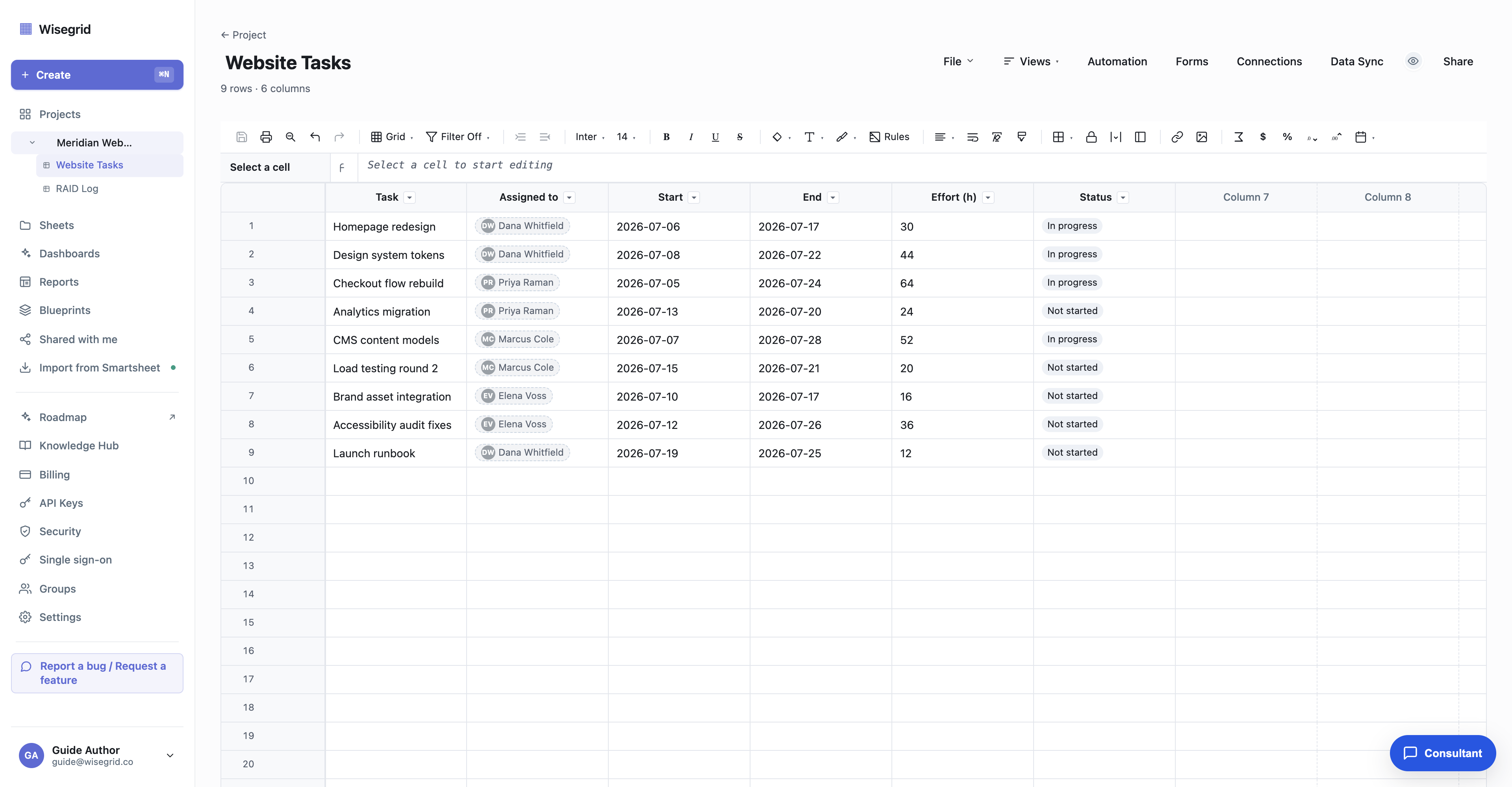
The heatmap reads from the sheets you already run work in; it does not replace them. Each source sheet needs four columns so Wisegrid can place work on a timeline and total the load:
- Who: a Contact (or Contact list) column, for example
Assigned to. - When: two Date columns,
StartandEnd. If the sheet already drives a Gantt view, these are the same date columns, ready to go. - How much: a Number column for
Effort. Per sheet, you choose whether effort means hours (an absolute number) or a percent of each person's daily capacity.
A row like "Homepage redesign, Dana, Jul 6 to Jul 17, 30h" is a demand statement the heatmap can place and total. Rows that have a person and effort but no dates are never invented onto the timeline; they surface in an Unscheduled tray instead, so phantom load cannot sneak in.
Open Resources and map your sources
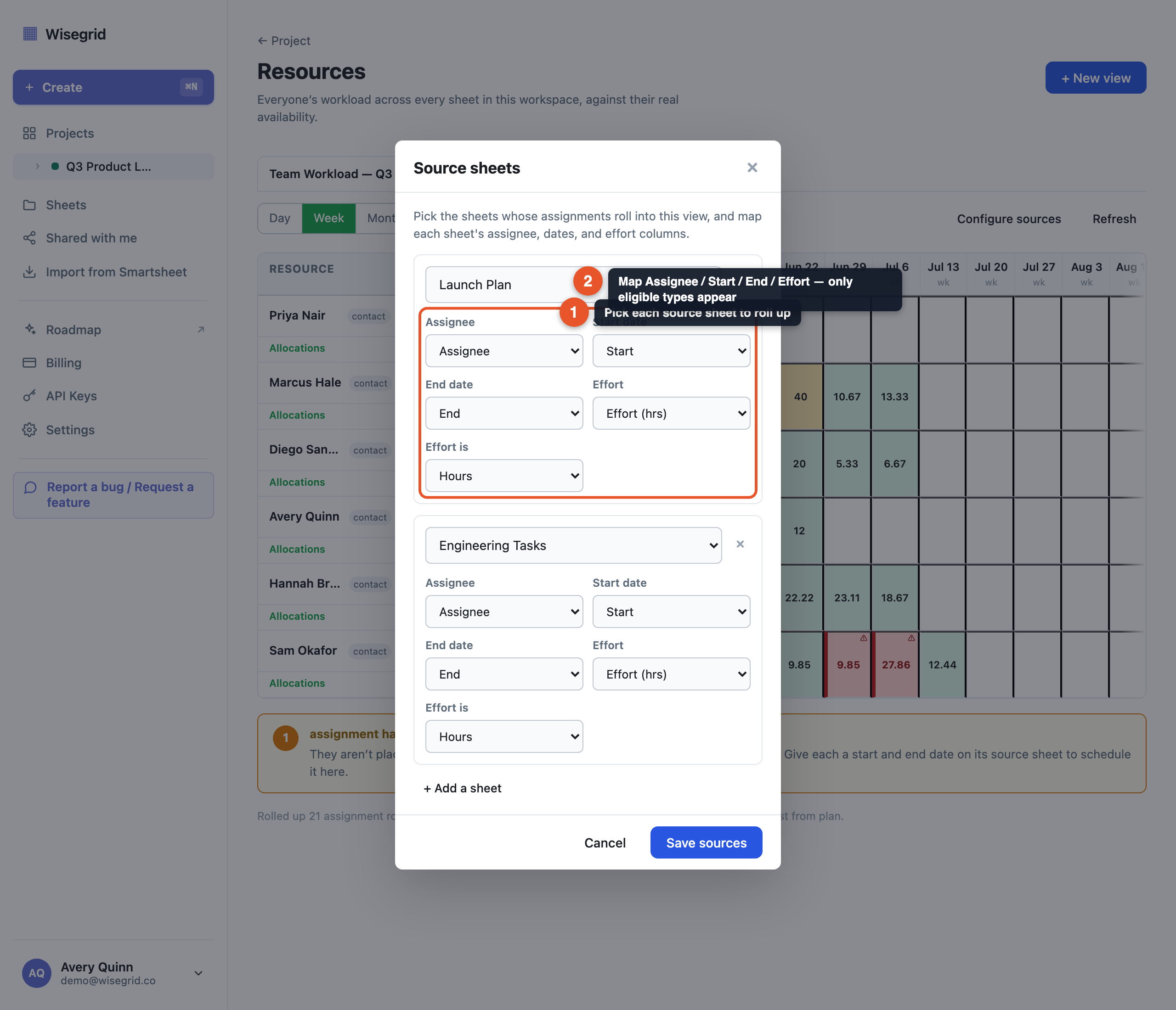
Resource planning lives at the project level because it spans all the project's sheets. Open the project and choose Resources from the project header, then click + New view and name it (for example "Design team, Q3"; a project can keep multiple named views).
In Configure sources, add each sheet whose assignments should roll in, and map its Assignee, Start, End, and Effort columns. Each dropdown only offers columns of an eligible type, so you cannot build a mapping the server will reject. Click Save sources and the heatmap builds immediately.
Resource planning is included in your plan (checked on the project owner's plan). Entering effort values on a sheet is normal editing; the cross-sheet rollup and availability profiles are included too.
Model real availability per person
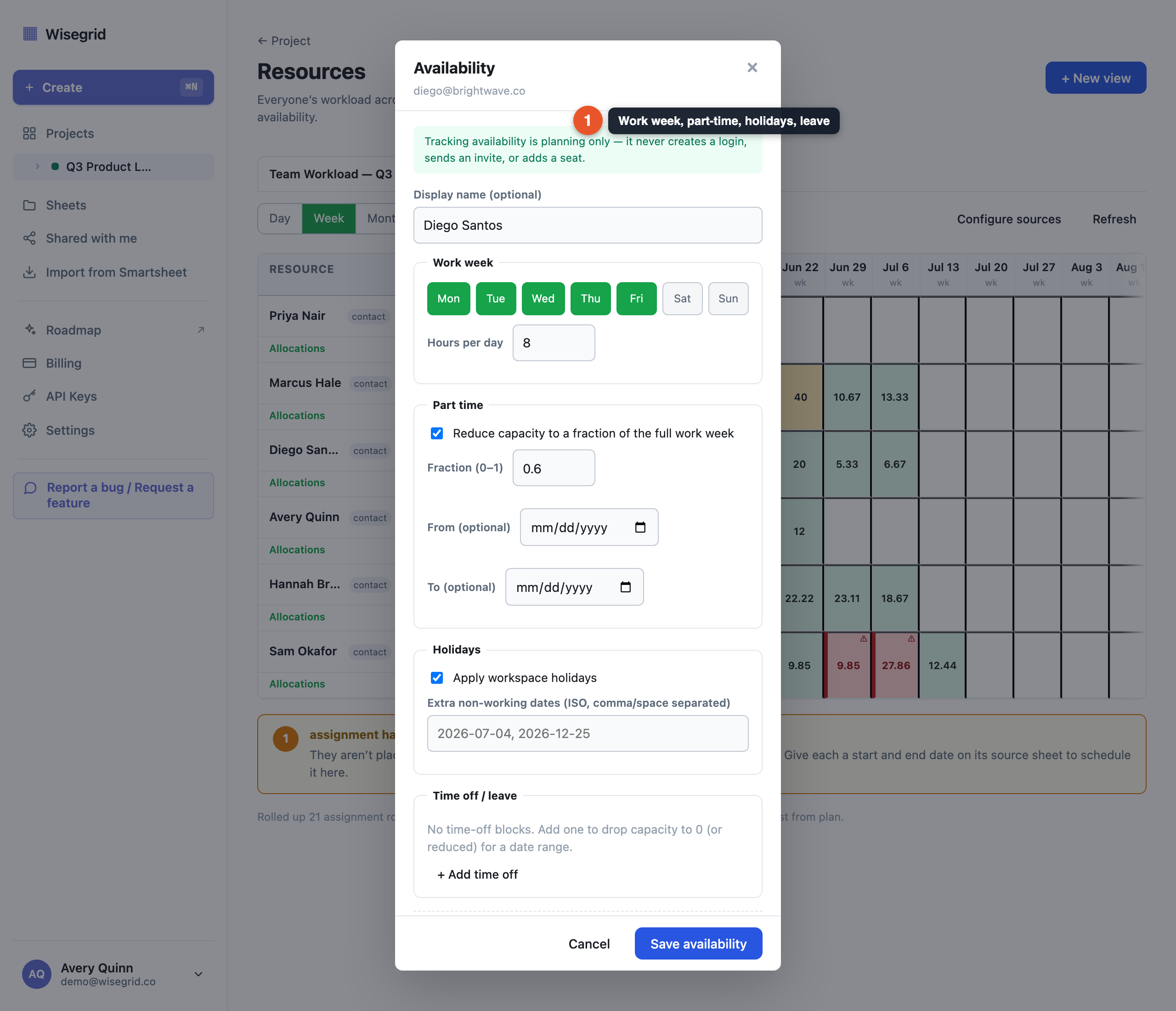
Capacity, the denominator behind every color, comes from each person's availability profile. Click a person's name in the heatmap to open their editor and set:
- Work week: which days they work and how many hours per day.
- Part time: a fraction of the full week (0.6 means 60 percent), optionally only within a start and end window.
- Holidays: the workspace's shared holidays, plus any extra non-working dates.
- Time off: date-range blocks that drop capacity to zero, or to reduced hours for partial leave.
A live "typical week" preview updates as you type, so you see the effect before saving. Availability is keyed to an email address, not an account: external contractors and vendors get full profiles and appear in the heatmap without ever becoming a login or a billable seat.
Read the heatmap and find the problem before it bites
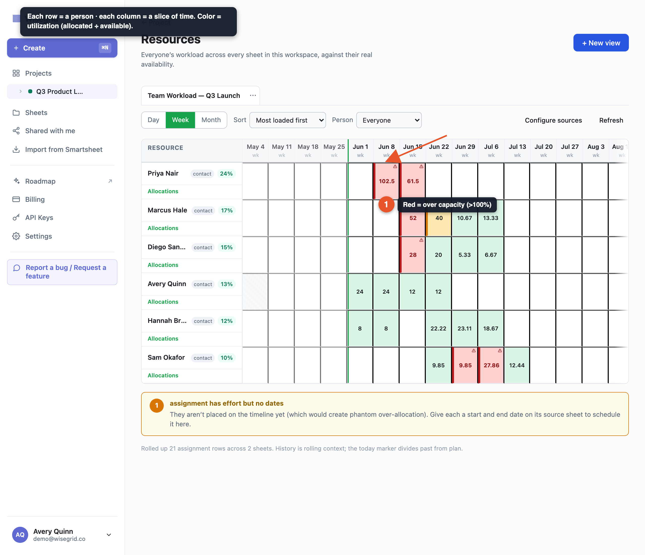
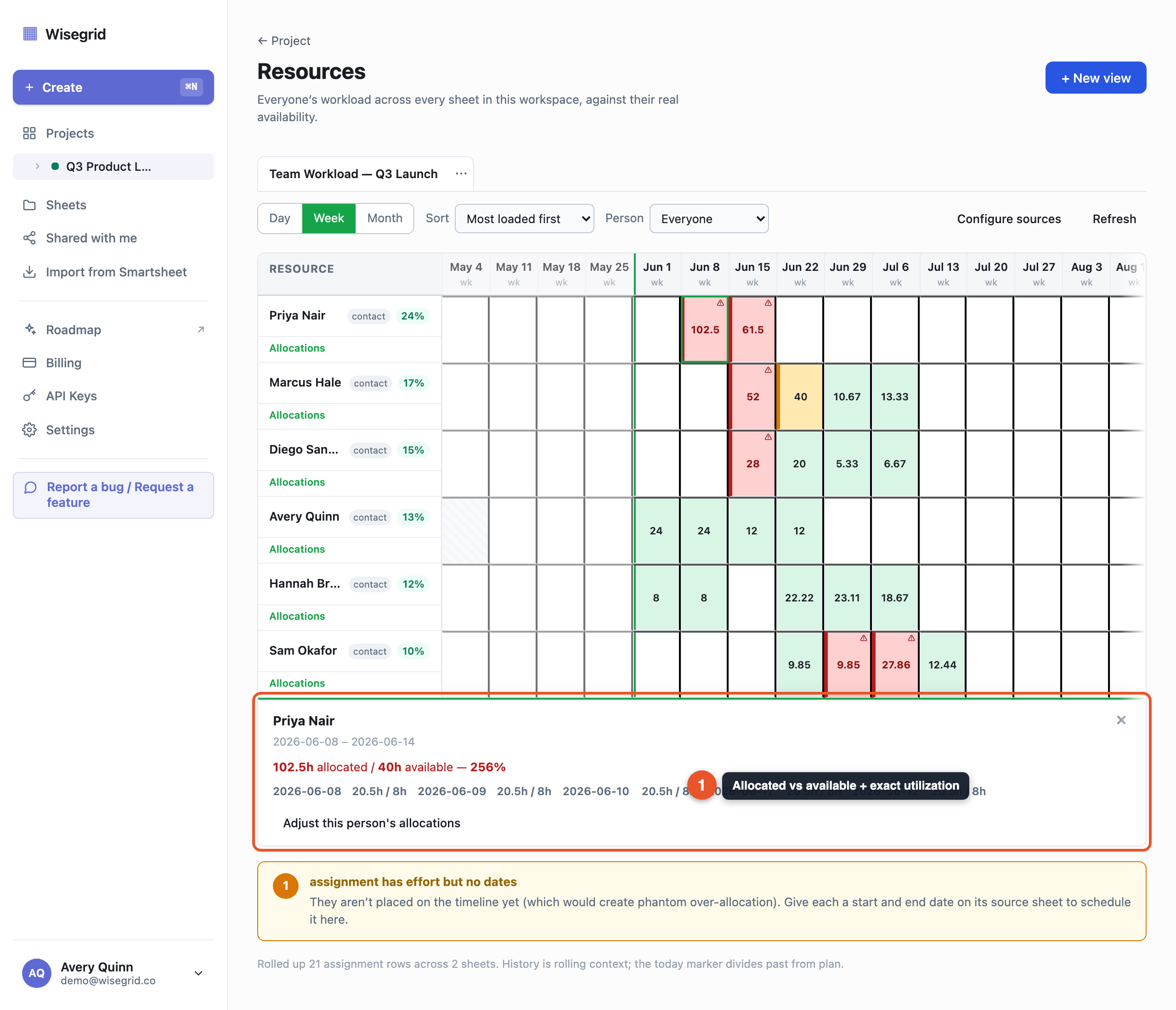
The heatmap is people as rows, time as columns, and utilization as color: green is comfortably under capacity (up to about 85 percent), amber is approaching full, red is over 100 percent, and a hatched cell means zero capacity with no work assigned (a day off or leave). Work scheduled on a day someone has zero capacity is always red, never hidden.
Click any cell for the detail popover: allocated versus available hours, the exact utilization ("102.5h allocated / 40h available, 256%"), and a per-day breakdown of what drove the overload. Zoom between Day, Week, and Month; sort people by most loaded; or filter to one person. When a row assigns several people, its effort splits evenly by default, and you can pin any person's share to override the split.
Roll it up on a dashboard
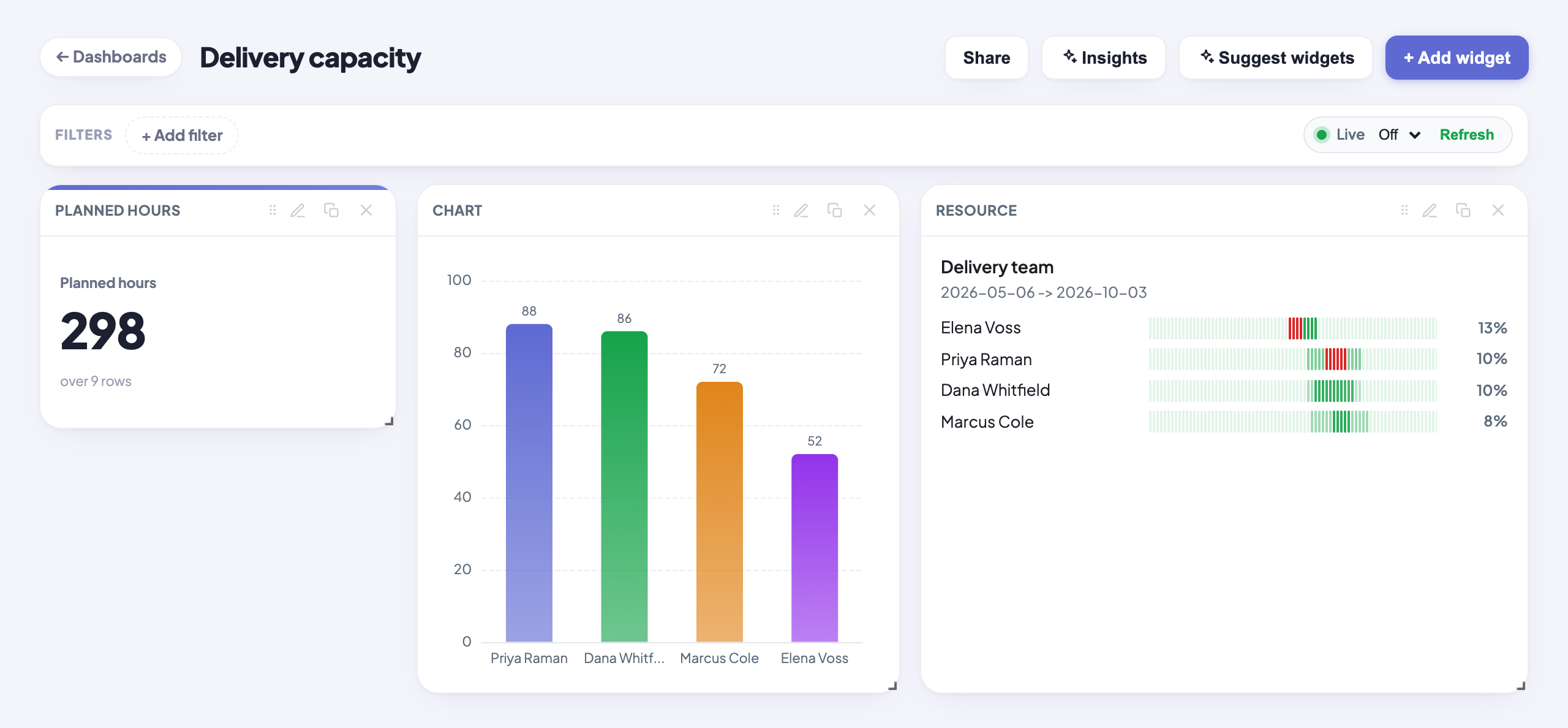
Two rollups close the loop. First, dashboards have a dedicated Resource heatmap widget: embed the availability view you just built directly on a dashboard canvas, next to the numbers your stakeholders already watch.
Second, for the demand side, build a report across your source sheets (Reports pull rows from many sheets in one project into a single live view) and group it, for example summing Effort by assignee or by sheet. Reports are gated by your role on the project, not by plan tier. Metric and chart widgets can then source from that report, so a "total planned hours" KPI and a per-person bar chart sit beside the embedded heatmap, all updating live as the sheets change.
What you end up with
- Demand structured in the sheets you already run: who, when, and how much, in typed columns.
- A cross-sheet heatmap that shows every person's true utilization against their real availability, with over-allocation in unmissable red and the receipts one click away.
- Availability profiles for everyone involved, including external contractors, without creating logins or paying for seats.
- A dashboard that embeds the heatmap and pairs it with live, report-sourced demand numbers.
Honest limits: a resource view is scoped to one project in this version (the same person in two projects has two independent heatmaps), history is a rolling 60-day window, and very large rollups are refused with real numbers rather than silently truncated. Smartsheet sells this capability as Resource Management, a separate add-on; Wisegrid includes it in your plan at $19 per editor per month.
Build it on your own data.
Start your 7-day free trial, or migrate your Smartsheet workspace with one token.